UX/UI DESIGN
Nestfinder
PROJECT TYPE
University Capstone Project
DURATION
Jan - Apr 2022
(4 months)
ROLES
UX Designer
UX Researcher
Content Writer
TOOLS
Figma
Illustrator
Photoshop
DELIVERABLES
Interactive Prototype (Mobile & Desktop)
Design System
UX Personas
User Flow
TEAM
Vincent Robson
Sophia Stafford
Riley Sauer

The Prompt
Our final year project was themed around the UN's 10th sustainable development goal, Reducing Inequalities. We were prompted to find a prominent issue that affects select groups of people, and ideate digital solutions that are viable enough to sustain themselves as a venture.
We had breathing room - but no issue is more important than another
The Solution
We ultimately decided to pursue the creation of a digital service to help immigrants find housing in regions that fit their personal, familial, and communal interests; with a focus on helping them get access to the cultural resources needed to assimilate well within Canada.
We would accomplish this with a smart scrolling map that features properties for rent/purchase, along with a filtering system to help users personalize the map to their unique and cultural needs.
The Audience
My first role in the first phase was in UX Research, where I focused on reconciling the needs and wants of the intended audience with our proposal. Considering our user base, Canada has an extremely diverse immigrant population, making ethnic demographics unhelpful in deciding key aspects of our service. We instead focused on age-related characteristics, delved into the reasons why immigrants of various age groups immigrated, and attempted to identify their pain points pre-immigration and post-immigration.
Using questionnaires and interviews, we inferred their needs and created the following personas:


Our persona research, along with our interview data with relevant stakeholders such as real estate agents and immigrant consultants, helped us arrive at three critical inferences:
Due to rapidly rising housing prices, immigrants are interested in moving to smaller, developing cities that are up-and-coming
2
The most important resources to immigrants are Schools, Places of Worship, Public Transport and Community Resources
1
Due to a lack of credit history, funds, and familiarization, most immigrants look to rent housing for the first few years
3
The Product
My role in the second and third phase of our project was in UX Design. My focus was primarily taking the major inferences from UXR and ensuring that it influenced our final experience, making decisions like:
1) Making our product a website along with a mobile app, to be accessible yet suitable for in-depth research
2) Not requiring account creation, unless users wish to save or contact certain properties - to prevent obstacles within their already complicated research process and user flow (which can be seen in higher clarity here)

MapFinder
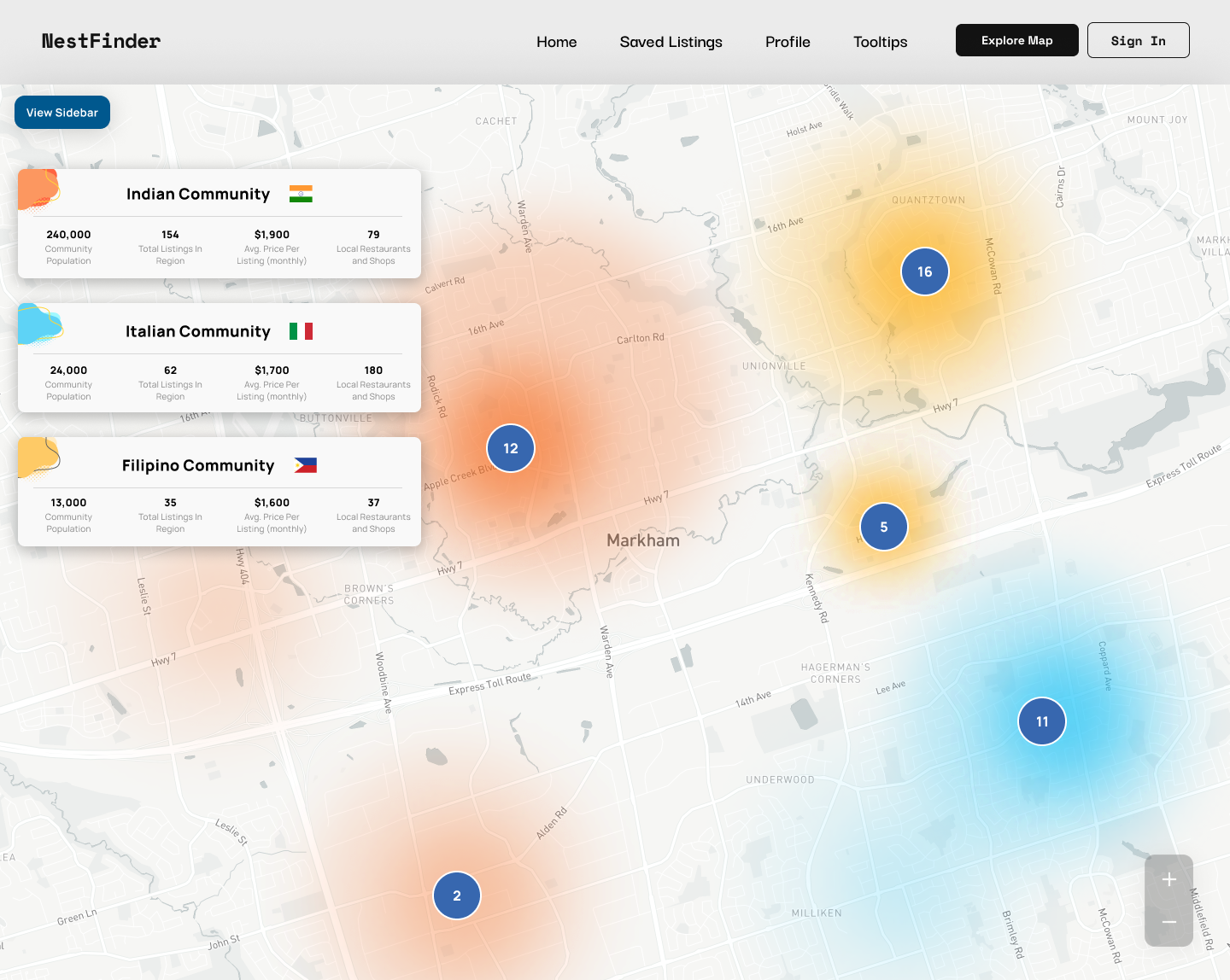
The primary feature within NestFinder is our scrollable map, that provides the location of properties along with ethnic demographics of the region along with cultural resources within the area. Initial versions looked as such:


Our user testing highlighted system inconsistencies, unclear affordances and a cluttered filter setup. We made some major changes for our MapFinder system to improve upon criticism, into a three-tier map system shown as below:

First Level: Province-Wide
displays a map of a selected city, populated with heatmaps representing high concentrations of the user’s communities
Second Level: Region-Wide
displays a region-wide view of the map, along with census data specific to their districts
Third Level: Street View
displays a neighborhood-wide view, with pins marking listings along with Places of Interest or POIs
Our research factored heavily into every design decision


SECONDARY
Schools, Places of Prayer & Public Resources as high priority resources

PRIMARY
Listings since they lead to our HVAs

TERTIARY
Public Transport as the most populated resource
Sticky Zoom Button to allow users to easily switch between map levels
POIs that indicate resources - in a hierarchal visual design that utilizes color and scale to prioritize:
Tooltips to assist users with understanding map functionality
Sliding Button Toggles to allow users to easily filter and track what POIs are shown on the map
Explore Page
The Explore page provides a basic explanation of our service, along with AI-generated categories of listings based on the user’s personalized information - such as within regions with higher populations of their cultural community, or rapidly developing up-and-coming regions.


Favorites
On the favorites page, users with accounts can view listings they have saved, organized in two views according to how they wish to compare listings.
1) The first view allows users to compare listings within certain communities/districts. It provides them with a demographic breakdown of the district as well.
2) The second view allows users to directly view all their saved listings, and also sort them based on price, last saved, or communities.
Criticism & Conclusion
While we did our best to make our product match our UXR inferences, the complexity of the overall product led to some inconsistencies in affordances (specifically for the MapFinder feature). Furthermore, we could have referenced other competitors (such as realtor.ca) to understand how they manage to create a comprehensive and intuitive tool.
Despite all of our skill sets being relatively different, we did our best in creating a high-quality prototype while constantly critiquing the choices we made, as well as fleshing out proper design systems and brands despite some of our lack of experience. This was by far one of the most in-depth projects I have had the pleasure to work on, with such a great team.


